Top 5 Best and Worst NBA Cup Courts for 2026 Season
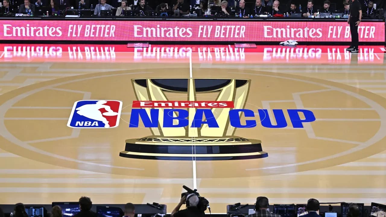
NBA Cup Courts Bring Color to the 2026 Season
The NBA season has just started, but the NBA Cup is already underway. Starting October 30, teams compete in group games through November, with the knockout rounds arriving in early December. Last year, the Knicks claimed both the NBA Cup and the NBA Championship, sparking hope that this year’s winner might signal the league's direction.
Every NBA court features special NBA Cup colors this season, though the designs are more uniform compared to previous years. Let’s look at the best and worst courts around the league.
Top 5 NBA Cup Courts in 2026
- Cavaliers: Cleveland's court shines with gold accents matching the trophy imagery. The deep red playing surface combined with gold sidelines and baseline creates an elegant look, inspired by last season’s playoff colors.
- Nuggets: Denver’s dark red court stands out among NBA Cup courts. Their tri-color theme comes alive with the blue logo at center and yellow borders, giving a unique vibe despite some fans not loving the red.
- Timberwolves: While gray is common across NBA Cup courts, Minnesota’s shade fits well with their updated colors. The subtle gray floor contrasts nicely with the bright blue around the court and a clearly visible new logo at midcourt.
- Mavericks: Dallas chose a bold blue and black combination over a bland gray. This allows the gold trophy designs in the paint and center court to really pop on their bright blue surface.
- Jazz: Utah didn’t need much change to stand out. Their unique purple court paired with sky blue borders matches their jerseys perfectly, making them the only team with purple as the base color this season.
5 Least Impressive NBA Cup Courts of 2026
- Warriors: Golden State’s court mostly features gray, a color absent from their usual palette. With a normally striking design, it's puzzling why gray dominates their NBA Cup floor.
- Lakers: Los Angeles' court is mostly yellow with black borders, but the yellow is a harsh highlighter shade rather than the warmer tone fans remember from the Kobe era. Purple appears only in a small midcourt logo, missing a chance to add more color around the edges.
- Grizzlies: Memphis ended up with a dark gray court, which feels dull given their limited use of gray in their colors. Blues from their palette or even their throwback hues would have looked livelier.
- 76ers: Philadelphia’s blue-on-blue court lacks the patriotic flair the team could showcase. Navy borders over a royal blue floor fail to create contrast, despite the team’s strong ties to American imagery.
- Spurs: San Antonio went with an almost black-on-black scheme. Their very dark gray floor blends into black sidelines, losing any real contrast. The Spurs missed a chance to incorporate their colorful Fiesta palette if the league had allowed it.